Create A Cool Typography Effect in Photoshop CS3 or Photoshop CS4. The effect is a cool-looking and great for decorating your Typography. We will be using a combination of layer styles, color blending, lens flare and images. The end effect is quite stunning and hopefully you’ll pick up some tips you didn’t know before.
[sociallocker]
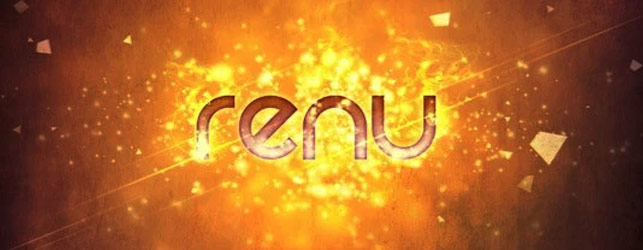
Final Image for the Typography Effect

Skill Level:
Intermediate
Resources:
Particles Pack by Media Melitia
Smoke Pack by Media Melitia
Hysteria Texture by Pareeerica
Rezland Font from Dafont
Step1:
Create a new document in Photoshop, 1280×1024 pixels, 72dpi. We begin with a radial gradient, by double clicking the layer to activate the Layer Styles menu, then apply a gradient overlay. Here are the exact color codes:
Foreground Color – #f2d445
Background Color – #98a843


Step2:
Next we will create our particle background. Open the Media Meltia Particles008.png image and drag it into your document, then apply a Color Dodge blend mode, name this layer “Particle1“.


Open the Media Meltia Particles006.png image and drag it into your document above the first particle layer, then apply a Color Dodge blend mode, name this layer “Particle 2”.

Scale the Particle 2 layer to fit the document size, by selecting the layer and clicking, Edit > Transform > Scale. Hold the shift key to scale the image proportionally.

Step 3:
Create your type by dragging the text tool to create a text box (Text box, gives you more control of your type).

Step 4:
Add some cool layer style effects by using the Blending Options (double click the layer to activate the Blending Options).

Layer Style 1 – Inner Shadow

Layer Style 2 – Outer Glow
Color Code: #f7db6a

Layer Style 3 – Gradient Overlay
Foreground Color – #918d14
Background Color – #fbfbfa

Layer Style 4 – Gradient Stroke
Foreground Color – #f8d04a
Background Color – #f6e6b5


Step 5:
We will now create some particle effects over the text. 1. Duplicate the “Particle 2” layer and drag it above the text layer 2. Create a mask for the “Particle 2” layer by clicking : Layer > Layer Mask > Hide All (if you do not see the layer mask feature in Photoshop CS3/CS4, click Window > Workspace > What,s New in CS3/CS4.
Step 6:
The layer will seem to disappear when you apply the layer mask, but do not worry, it is still there, we will now reveal the layer by painting the mask with a soft white paintbrush. Select the Brush Tool with Diameter 45pix and Hardness set to 0%.
Foreground Color – #ffffff
Background Color – #000000


Start painting with your new soft white brush, the particles will begin to appear, if you need to delete an already painted area, just switch the brush color to black.
Step 7:
We will continue by adding some cool smoke effects over our text. Open the Smoke_V1_1071.jpg image and drag it above the particle mask layer. Scale the layer down to about 70-80% . Set the blending mode to Color Dodge.

Don’t overdo the smoke effect, we just want it to compliment the particles, so scale the smoke image down to a little further and use a soft medium Eraser Tool to erase any sharp edges and place the smoke at some of the bright white edges of the text, like the image below. Duplicated the first smoke layer and re-size and rotate it for each placement.

Step 8:
Now we will add some dramatic light streaks using Photoshop Lens Flare. Create a new layer and color it 100% black with the paint bucket.
Click Filter > Render > Lens Flare.

Set the blending mode to Color Dodge
. 
Resize the lens flare layer vertically Edit > Transform > Scale, then reduce the lens flare size horizontally.

Rotate the lensflare and place them around your text, as shown in the example below. I duplicated my first lensflare to save time and resized a couple of them a littl smaller at 48% opacity to create a sense of depth in the scene. Don’t overdo the lens flare, the goal at this point is to create balance and harmony with all the other elements.
. 
Step 9:
Create a new layer above the lensflares, and name it Vignette 1. Give it a radial gradient.
Foreground color – #0a5570
Background color – #ffffff

Set the Blending Mode to Multiply and the Opacity to 48% Create another layer and name it Vignette 2. Give it a transparent radial gradient.
Foreground color – #000000
Background color – #ffffff
Make the foreground transparent by, clicking on the gradient tool, then open the gradient preset.
![]()
Create the gradient, then give it a 22% Opacity, use a large soft Eraser Tool brush to erase the middle portion of the vignette, so your type remain nice and bright. You won’t see much of a difference from the last vignette we did, The reason we did this step is to make the edges of the image a little darker, so that our eyes focus on the Type.

Step 10:
Create a new Color Balance Adjustment Layer by clicking the “half moon” symbol on the layer pallet.
Cyan -61
Magenta -38
Yellow +27

Create another Color Balance Adjustment Layer.
Cyan +100
Magenta -30
Yellow +1

Step 11:
Open the Hysteria Texture by Pareeerica, drag it above the color balance layers and set the Blending Mode to Hard Light. Change the Fill to 79%.
Final Image
Conclusion:
PURCHASE .PSD FILEThat’s it, a cool-looking effect to enhance your Typography using some simple Photoshop effects and color blending. The end of the tutorial was achieved by experimenting with color balance. Try different color combination’s, this can give you some surprisingly cool results. Have fun!
And be not conformed to this world: but be ye transformed by the renewing of your mind, that ye may prove what is that good, and acceptable, and perfect, will of God. Romans 12:2
[/sociallocker]


112 thoughts on “Create A Cool Typography Effect in Photoshop”
Typography is one of best practice to dominate in media.
very good
Thanks
Really very cool typography and it’s educational. Thanks
Ty for the Tutorial, learned a lot. 😀 here is my use of the tutorial:
i want to design blinking text using adobe photo-shop. pls tel me the steps
My colors arn’t as vibrant as yours, and the vignettes arn’t showing up at all. The effects are showing up, but it’s not doing anything….
But the result without looks cool too. 🙂 Love it!
Thank you 🙂
-Tony
EXCELLENT tutorial! Well thought out and concise with beautiful results. I thought I’d share the fruits of my work from using this tutorial: http://turningdigital.com/obsession.php
Wow.Beautifully done. Thanks for sharing.
Thanks for awesome tut man
What text style are you using ?
Well, thank you so much for this tutorial. I love Mariah Carey and I did mine http://img339.imageshack.us/img339/172/lollot.jpg you are amazing!
Great tutorial, but I dont get the vignetting one.
My background color became worse.
Can you help me pls?
Reduce the opacity, that may help.
Wonderful tutorial…Helpful for beginner like me..thanks for sharing this.
Very, very helpful for beginners like me. thank you so much. 😀
Great job! Love the look and the howto is very nice. Thanks for sharing the technique.
Great tutorial. Very nice effect. Now I just can’t stop myself to try this.
Thanks for the post.
You are welcome, have fun with it 🙂
Thanks loswl!
I will give it a try again, I looked at a few other tutorials on vignettes, thanks for the explanation – don’t know why it didn’t want to work. I used a few different techniques to make it look like a vignette. Thanks for the explanations!
I really like your tutorials!
Great tutorial and very well explained! I only had a little bit of problems understanding the vignette steps but managed to recreate your tutorial. You can see my result on my blog!
http://tballsdesignblog.wordpress.com/2010/10/07/cool-typography-effect/
Thanks for a great tutorial, can’t wait to try another one. Keep them coming!
Hi tball, very nicely done 🙂 I will try to explain the vignette process.
1. Create a New Layer
2. Create a gradient from Black to Transparent.
3. Take a large soft eraser brush and erase the middle of the the gradient.
4. Reduce the Opacity of the Gradient, so that it blends in with your background.
Here is another way you can do it, there are always multiple ways of doing things in Photoshop 🙂
Creating a Vignette in Photoshop Tutorial
Hey! Good tut but i found some of it just didn’t turn out how yours did. I deviated from your tutorial a lot and ended up with lots more layers had to bring in some blending to perk it up as it looked quite dull, the Vignette’s didn’t turn out how i had hoped so i improvised with the feather tool and it came up looking ok!
http://img101.imageshack.us/img101/7976/gfxnetbg.jpg
very helpful tutorial also the way to describe the steps is very good to make me understand well
thanks
It’s cool now man! I found it on youtube how to do it 🙂 Ty for the tutorial!
Ok, cool..glad you figured it out..go Youtube!! 🙂
When i am doing the vignette 1 and 2 it doesn’t happen! What did i do wrong? Go Jesus 🙂
Hi Joffe, I am not really sure why it is not working for you. But basically a Vignette is made by Creating a simple gradient from Black to Transparent, then erase the center with a large eraser brush. The last step is to blend it with the image below by reducing the opacity….Hope that helps.
Sorry I’m quite new hehe.. I gonna create a layer then double click on it so the layer style is coming up.. Then u click on gradient then double click on the color thing then click on that that its black and transparent.. That what i did on the vignette 2.. vignette 1 i created a new layer and took those colors u said then double click on it and click o gradient tool and did it blue and white then on blend mode i take multiply and that.. But its not getting dark
Wow great text effect! I tried it n absolutely worked. Thanks for sharing this tutorial.
hey dts a nice one…liked it.
ok, u can delete the previous comments, thanx a lot, u can see this. http://theeyevan.deviantart.com/art/Jesus-Cares-169571617
Cool, I love it! love the glowing cross and the font you used. Please upload to our Flickr Group :).
I always love your art .. GBU
Thank you for checking out the tutorial 🙂
This was fun! Thanks for the idea!
hi,
im new at photoshop… i wanted to try this… ive downloaded all needed but when i tried to drag the particles… it says that the file format module cannot parse file… i dont know what to do to put the particles.. thanks 😀
Hi Erich, I don’t know which version of Photoshop you are using and I have never seen that error before. You can try placing the particle image by clicking >File > Place: after the image is placed inside your document, you will see a X on the image… click the “Move Tool” and a dialog box will appear that ask if you want to place the image, click yes.
Very cool. Thanks for choosing my texture in your tut 🙂
No,… Thank you for making it available 🙂
oo wow..love this tut cuz it got my name :P..lukz awesome..thankz..will try it for sure ^-^
Here is what I got
http://kurama805.deviantart.com/art/Pikachu-Wallpaper-163880852
put a few twists here n there but its the same basic idea
thnx for this n all the freebies!
Fantastic tutorial, thanks for sharing.
Great tutorial nice explanation
Thanks for sharing your skills
You are welcome, thanks for checking it out 🙂
This is a great tutorial. I love the way you set up the tutorial, the step by step process was easy to follow. You really made it so there was no confusion. I know it must have taken you longer to make sure you included every single step in detail and showing everyone how to do this without skipping even the steps that seem simple. Thank you so much, I really appreciated it. I wish more people set up their tutorials the way you did.
Thank you Nikky, thanks for the compliments on the tutorial, I wrote the tutorial in that style because I read tutorials before where I get to a point where I do not understand what the author is doing, so I am careful not to repeat the same mistake, because the tutorial is available to all types of readers, beginners to advanced, thanks for noticing 🙂
Here is a link to what happens when I apply the first particle layer with the effect.
http://img163.imageshack.us/i/monkeyj.jpg/
I cannot figure this out, please advise on what I am doing wrong.
I have followed the instructions 7 times through to the letter, same result.
If I use linear burn colors at least show up, but it certainly is not as impressive. Any and all help is much appreciated.
Awesome tutorial by the way if I could just figure out what I am doing.
From the jpeg, it seems as if either you do not have a dark enough background or you are working in cmyk mode. I would have to see your Photoshop File to tell exactly what you are doing wrong. either that or you can download the Photoshop file at the end of the tutorial and see how it is done in the file…did you try “Color Dodge” ?
Man I am trying to do this one and am following your instructions to the letter.
Every time I do the linear dodge (add)it just goes white with the littlest bit of goldish yellow in the middle.
I am using cs3. What is going wring?
Tutorial updated, use “Color Dodge” instead of “linear dodge (add)”…they both do practically the same effect, make sure your background is dark enough for the effect to work.
Here’s my attempt.
http://www.flickr.com/photos/49341656@N06/4523382531/
Checked it out, very nice, I really love the colors you used 🙂
Thanks for the tutorial. I’m rather new at this with only enough knowledge to make me dangerous, not useful. Anyway I discovered I had done mine in RGB and not CMYK so my colors didn’t look quite as good but with a little tweaking I made it work.
I also tried the link for the .psd file at the bottom of the tutorial & it didn’t work it was some other weird file. Am I not understanding what that really is?
Hi Julie, thanks for checking out the tutorial, even though you are new at this, you are still useful, we all start from somewhere. I created the file using RGB Mode, the only difference in my file is that I did some extra color adjustments for the final image.
The file for the PSD File is a Zip file (The ZIP file format is a data compression and archive format.). If you are you are using Windows XP, Right click the file and click “Extract here”. If that does not work, download Winzip (free program) http://www.winzip.com/downwz.htm after you install Winzip, right click the file again and click Winzip > Extract to Here.. Let me know if that works for you.
I’m using a Mac does that make a difference?
When I have a little more time I’ll upload my graphic so you can see what I came up with.
Thanks!!
You can unzip the file on a Mac. here is a link to explain how to do it: http://www.scrapwow.com/help_how_to_unzip_a_file_on_a_mac.asp
You’ve been extremely helpful! Thanks!!
You are welcome 🙂
OK. I figured it out & got it to open. The .psd file is in a .RAR type file & I had to install winRAR and then it worked perfectly.
nice tuts!
here’s mine..
http://i888.photobucket.com/albums/ac86/crave_kevin/renu.jpg
Very Kwel!
really awesome effects!
could i use this tutorial on a logo design contests? ( i just wanted to get permission first, if i could)
If you design the logo using the techniques, then you are good to go, but if it looks exactly like what I have done, please DO NOT submit it for a contest. thanks.
kay, thanks! i will change up colors and letters, etc etc.
Hope you win, would love to see the finished product, please share a link to it here, God Bless 🙂
thanx!
rsrsrs…Sou do Brasil… Glorie the God!!!
lol … I’m from Brazil … Glory to God!!
God Bless 🙂
Nice job! Looks like this kid liked it so much that he copied it and claimed it as his own… http://rivahratt.deviantart.com/art/Renu-155974102
Thanks for pointing that out, very interesting that he would do that, but hey, it is the internet 🙁
Is it possible to do this also in CS2? As this is what my pocket can purchase at the moment.
Do u also have a tutorial that works around making logos scalable in Photoshop.
Thanks.
Hi i-Cre8, the tut can be done in CS2, some of the layer styles have changed a bit in CS3/CS4 but, it should not make any difference. In step 2 you can use the “Color Dodge” instead of “Linear Dodge(Add)”, hope that helps.
I usually do logos in Illustrator, because that is the correct program to use, why? because Illustrator is a vector based program that allows you to scale your logos to any size you want without losing image quality. Photoshop is raster based, the images are made up of small pixels, so any time you scale the logos to a larger size, you loose image quality. Saying all that, there is always a way to work around such problems if Photoshop is the only program you have. I will think of a tutorial that uses Photoshop alone for logo scaling.
Thanx a mill man ur da best. U got a fan page on facebook? Cuz i dont use twitter
Hi Kern, look on our sidebar at the bottom, you will see our Facebook Fan widget or you can go directly to the page here: INSPIKS on Facebook
Hey loswl m also a believer, congrats. I admire your work its great. I tried downloading the PSD. file for this design but it says corrupted. Can u email it to me thanks.
Ok gotcha.
Very interesting way of making great looking text. You make it look so easy. Thank you for sharing I will have to experiment and try to follow your tutorial.
Thanks for the compliments, give it a try, feel free to ask any questions 🙂
Wow, this is a really great effect and I love the tutorial. Very helpful, I’ll definitely be checking back regularly for more. =]
Thanks for checking it out Yari, we have more tutorials coming soon 🙂
Very nice tutorial.
Keep up the good work !!
My version is here : http://www.flickr.com/photos/maximelaforet/4398329769/
A very nice rendition of the tutorial Macxim 🙂
i dont have that Media Meltia Particles008.png where can i find it??? great job…i want to try it… but im having a problem with that png file… im using windows
There is a link to the file at the beginning of the tutorial under “Resources” and I also placed a link to the file in that part of the tutorial. The file is in the “Particles Pack – 25 Free Images”. You should be able to open the file on either Windows or Mac in Photoshop CS/CS3/CS4. Let me know if that helps.
Bookmarked, this tutorial is top class, thanks a lot
Text effects never get old, there are an endless amount of things you do with todays technology, thanks for contributing!
Step 2 does not create the effect that you show i.e. add liner dodge to the particle.008. That does not make it blend with the layer 1 to create the effect shown in picture 2 of step 2.
What else do I need to do?
Thanks
Hi Kim, if you are using Photoshop CS3 or CS4 the effect should work, unfortunately the lower versions of Photoshop does not have the Linear Dodge(Add) blend mode (only “Lenear dodge”).
If you are using a lower version of Photoshop, you can use the Color Dodge blending mode, you should be able to get something close, let me know if you do, thanks.
Very very very nice tutorial! Keep it up! Would love to see some more tutorials here! 🙂
Really cool typography tutorial which i really like and sharing with my friends, for learning some easy steps to make typography effect like this.
Great tut! Here’s my attempt: http://Ruddy-J.deviantart.com/art/RENU2C517-152089648
Very Nice JB, I love how you broke the text up, really solidify the message 🙂
Very nice JB, love the addition of the cracked text – more motion 🙂
alrighty, here’s my try at it! not even close, but I had fun! 🙂
http://www.flickr.com/photos/34827444@N08/4309580583/
Nicely done, glad you had fun with it, the most important thing is having fun while learning something new, later you will see that these techniques become second nature when doing other projects,
Very nice execution 🙂 Looks great and love the message of hope.
great tut, now just have to figure out if I can convert to psp lol. thanks for the inspiration! 🙂
Wow, this is sooooo cool!!!
Nice tutorial. It would be good to try.
Very nice tutorial Loswl
Wow, this is sooooo cool!!!
Thanks so much for all the detail included, makes it A LOT easier for us newbies, and for including the actual files to download…please DO keep it up…can’t wait to see what’s next!!!!
Thanks for checking it out everyone. Lissett glad you found it easy to follow, tried to place as much details as possible, because some people are new at this. If you try out the tut, please feel free to place a link here or in the Flickr group http://www.flickr.com/groups/inspiks/ so we can see it.
Nice tutorial. It would be good to try.
Very nice tutorial Loswl 🙂
Thanks for to share your skills with us; with this action we are getting an internet more friendly for all…
Really cool as you said:)
Very, very good job. I really like this! I’m going to do this tut tonight! Thanks!
good job … cool effect 🙂
nice tut bro! techniques really kl.
Very nice tut! I’ll give this one a try tomm
Fantastic tutorial loswl. I love the meticulous attention to detail you have put into this post. Outstanding! I would also like to thank you so very much for including our Particles and Smoke packs in this tutorial. We really appreciate the support. Take care.
Thanks Jeya, for all the freebies on your website, really top quality, really inspired me to right this first ever PSD. tutorial.